


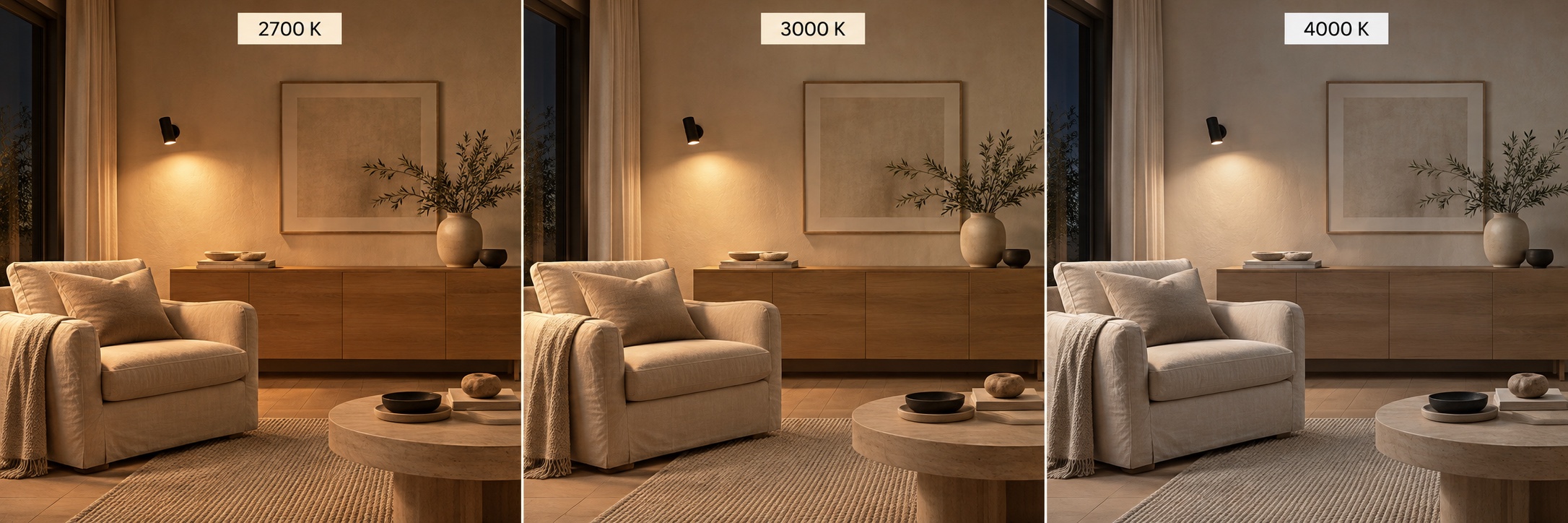
The same interior can feel cosy, calm or distinctly businesslike simply by changing the shade of white light. 2700K, 3000K and 4000K describe that shade. Here is how to find a suitable option and avoid lights that look mismatched in the same room.
Already choosing luminaires? Explore the Luminance lighting catalogue and check the colour temperature of the specific model before buying.
1. What do kelvins tell you?
Colour temperature is measured in kelvins, K. A lower number generally looks warmer and more yellow, while a higher number looks more neutral or cooler. It describes the appearance of the light, rather than how hot the luminaire housing becomes.
Do not confuse kelvins with lumens: lumens measure luminous flux. A 4000K luminaire does not necessarily produce more light than a 2700K model. To choose brightness, compare light output, optics and placement separately.
2. 2700K: a soft atmosphere for relaxing
2700K produces distinctly warm white light. Consider it for bedside lighting, evening living-room lighting and a pendant over a dining table. It works particularly well with timber, beige textiles and warm finishes.
If you enjoy a relaxed evening interior, start your comparison with 2700K. On a white wall it may look noticeably yellowish; that depends on your preferences and materials and does not indicate a fault. For reading, add a local light with suitable output and comfortable glare control.
3. 3000K: warm light for a coherent interior
3000K remains warm white but generally looks less golden than 2700K. It is a useful starting point for general apartment lighting, open-plan kitchen-living rooms, hallways and decorative accents.
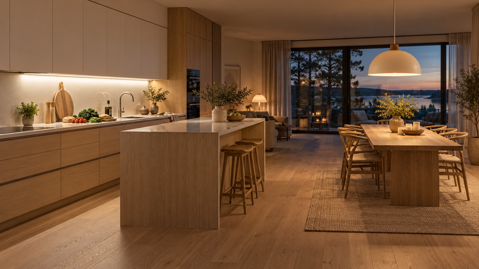
In an open-plan space, choosing 3000K as the main tone can make it easier to coordinate ceiling lights, pendants and concealed lighting. Compare track lighting systems and wall lights. Check each product specification: the same housing may be offered in different colour-temperature versions.
4. 4000K: a more neutral white
Beside 2700K and 3000K, 4000K looks more neutral. Consider it for kitchen worktops, a home workshop, a utility room or an office if you prefer a more functional-looking environment.
4000K is not a compulsory rule for kitchens or bathrooms. A bathroom can also be comfortable at 3000K: mirror-light placement, avoiding harsh shadows, colour rendering and a fitting suitable for its installation position all matter. Choose the tone for your interior and your own preferences.
5. Can you combine different colour temperatures?
Yes, with deliberate lighting scenes. For example, 4000K worktop lighting and a 3000K dining pendant can be operated separately. However, two different tones aimed at the same white wall will make the contrast especially obvious.
For a single task and one visible pool of light, coordinated sources are easier to work with. Before a larger purchase, test a sample in the evening against your own finishes. Matching K labels do not guarantee an identical appearance across different models: spectrum and manufacturing tolerances also play a part.
6. Three things that matter besides K
Light output and optics determine how much light reaches the intended surface. The colour rendering index, CRI/Ra, helps describe colour rendition but does not replace your choice of white tone. Where faces, food and textiles matter, consider luminaires rated CRI 90 or above.
Dimming reduces brightness; CCT adjustment changes the shade of white. A conventional dimmer does not turn every 4000K luminaire warm. Changing colour temperature requires a suitable feature, such as Tunable White or a specific Dim-to-Warm design. Check compatibility between the luminaire, driver and controls separately.
7. A short checklist before buying
For a bedroom or an evening living room, start by comparing 2700–3000K. For general lighting in an open living space, try 3000K as a starting point. For a task area, compare 3000K and 4000K using a real sample. These are starting points rather than mandatory standards.
Check the exact product’s colour temperature; view it against your walls and furniture; coordinate sources that will operate together; and compare brightness and controls separately. If you are choosing between two options, one real sample is often more useful than ten photographs.
- Check the exact product’s colour temperature.
- View the light against your own finishes and furniture.
- Coordinate sources that will operate together.
- Compare brightness and control options separately.
Find the right light for your interior
Explore the Luminance catalogue and compare colour temperature, light output and controls in the specifications. We can help coordinate general, task and evening lighting.
Explore the catalogue